The navigation bar on a website is an often overlooked and ‘simple’ section, but it is quite possibly one of the most important areas on your website. We have all experienced it before: poor website navigation. You try finding an address or article, wasting minutes, and it’s not where it logically ‘should’ be. It is incredibly frustrating.
I want you to remember that feeling, because you could be inducing that same feeling onto users that visit your website. The best content in the world does not mean anything if users cannot navigate to it.
So, what can you do to fix this issue?
Tip #1 – Start with a visual sitemap
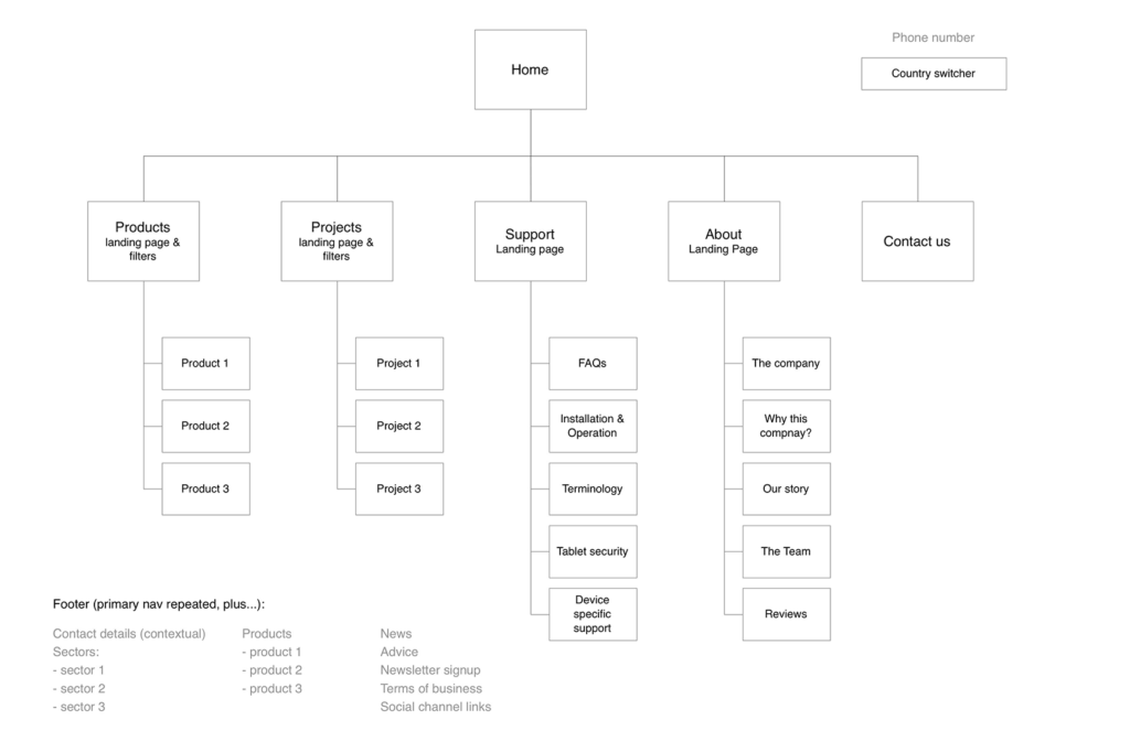
Just like a blueprint to a house, before you build your website, you need a structured plan. A sitemap is the blueprint to your website. It lays out the user journey and where important items like, blogs, contact info and other content go. Below is an example:

Once you create a sitemap on paper, you can create a digital version that can live on your website, which is important for search engines.
For a more formal sitemap definition, according to Google, a sitemap is a file where you provide information about the pages, videos, and other files on your site, and the relationships between them. Search engines like Google read this file to more intelligently crawl your site. And this is a crucial starting point in building positive SEO.
Tip #2 – Keep it simple
We are firm believers in the KISS methodology: Keep it simple, stupid. Not only is great for life and many other aspects, but it rings especially true for web design. Avoid creating too many options, or on the flip side, not having enough options.
If you have too many choices in your website menu, you make it hard for visitors to decide where to go. You’ll wear them out, and they may just leave your site and never return.
In addition, name your links so your website visitors know just what they’ll get when they click on the menu item. Avoid using industry jargon or ‘getting cute’ here because people may have no idea what you are referring and get frustrated.
Use wording in your links that makes sense and sends users to the right pages. Period.
Tip #3 – Text matters
In the past, web designers used buttons for links in the menu bar. Don’t do this. This was past and is best to be left there.
Today, you want to use actual text instead of icons or buttons because it’s better for search engine optimization and mobile/responsive designs. If you do not format an image correctly, it could look wonky on a cell phone or tablet.
Search engines use the text in your menu bar as they crawl your site. They use this text to determine the most important parts of your site.
Also, when choosing a font, find something with readability; nothing too thin or wispy and definitely no Comic Sans. Just stay away from that. We suggest Roboto, Georgia, Lato, Verdana and Helvetica. These should put you on the right track.
Tip #4 – Link your logo
This one may seem intuitive, but a lot of people forget this tip. There is no longer any need to put a ‘Home’ link on your navigation. If users want to go to the beginning, just click on the logo. We do it every day, you just may not realize it because it is ingrained in our behavior.
We hope you have found these tips helpful when putting together your site’s navigation.
Just remember: people are looking for an easy and seamless experience. Make sure you give it to them.
Serious about updating your POS? Check out the Northstar POS system to improve the power and effectiveness of your restaurant!

